A brand is the public face of a company and, as such, should be treated with the utmost respect and caution. Rebranding is sometimes necessary if you have a new mission or want to disassociate yourself from something negative. However, it is not to be entered into lightly and could spell disaster if you don’t get it right.
When the Sci-fi channel changed its logo to Syfy, they hadn’t done their research. Unbeknownst to them, Syfy is a slang term for syphilis! They had just named their channel after an STD – never a good move. Their thinking was that the younger, tech-savvy viewers would text it this way so they thought they were being ‘cool’ and could trademark the word Syfy but not Sci-fi. The viewers hated it, it was a marketing disaster, and they reverted to the original name.
Andersen Consulting in the US split with partners Arthur Andersen and let a marketing consultant pick their new name. They ended up with Accenture, which has been viewed as one of the worst rebrandings in corporate history. It is generic and tells the customer very little about what they do. It’s just a silly corporate, meaningless name. For help from a Brand Strategy Agency, contact Really Helpful Marketing, a leading Brand Strategy Agency.

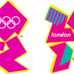
Sometimes you shouldn’t mess with the classics, and this can be said of the Olympic games. When London revealed their game logo in 2012, it was met with resounding disappointment. The designers wanted to jazz things up and bring fun into the modern era, thinking it looked young and energetic. Most people thought it was ugly, meaningless, and not in keeping with the style of the games.
Mastercard was another big business name that decided to dabble with its logo and got it all wrong. They had a unique and highly distinctive brand logo that they traded for something that looked overly complicated and messy. Sometimes simplicity does work, and the new fussy logo drew so much criticism that the company decided to revert to the original logo on their credit cards and keep the new one just for business communications.
Gap also decided to update its brand, and a new design was conceived that looked like a child had made it. Their iconic look was replaced with what they thought was a more modern look, but they received so much negative feedback on social media that they decided to revert. What a waste of time, effort, and company cash.
Tropicana did the same thing with a new packaging design which meant that their original, iconic look was replaced with something that didn’t stand out and looked like all other juice products. This new look wiped out the brand’s personality and history and set them back $35 million. Guess what? They soon reverted.